Population Infographic


Brief: With a focus on raw data, facts and figures, create an infographic or data visualisation focussing
on a subject specific to population.
Why Urbanisation?

I chose urbanisation as the topic of this project becuase I felt it was a wide choice with lots
of information/statiscs on the subject. I am a lover of all cities so I was drawn to this topic
from the beginning when I first heard the word population. I wanted to explore various aspects
of population within cities, for exmaple - positives and negatives of living in city areas, the growth
of people living in cities comapred to urban areas. I loved how many interesting facts I learned
due to this research, I also feel like urbanisation is such a prevelant thing happening all around us,
all the time. So, it was fun to become a part of it for a while.

The Process

Idea Generation

I started this project on paper, I initially began on dotted paper. This gave me a good idea on sizing. I brain-stormed some ideas of layout because I had to decide where I wanted the text vs images to be placed. I then drew out rough sketches of the illsutrations I wanted to inlcude in this infographic. I decided to use lots of bock shapes for this because I wanted my illsutrations to be clean and successful. I chose images relevant to cities and rural areas for example, trees, cars, buildings and traffic lights etc.

Gathering Data

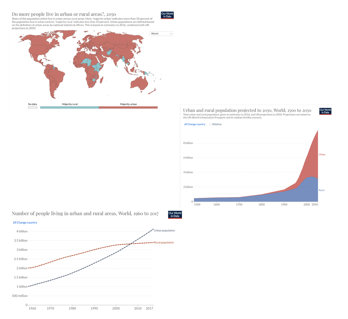
In order to begin designing and putting this infographic together, I needed actual inforamtion and statistics about urbanisation. So, I took to reliable sites that offered me data on the topic. I focused on urbainsation itself, the growth within the next 50 years, and urbanisation VS rural.
I researched all I could on all areas of urbanisation and tried to gather a wide range of facts, so I had various information to include in my infographic. But, with all of these statistics, I needed to narrow it down somehow.

Sketching on Paper

I started this project on paper, I initially began on dotted paper. This gave me a good idea on sizing. I brain-stormed some ideas of layout because I had to decide where I wanted the text vs images to be placed. I then drew out rough sketches of the illsutrations I wanted to inlcude in this infographic. I decided to use lots of bock shapes for this because I wanted my illsutrations to be clean and successful. I chose images relevant to cities and rural areas for example, trees, cars, buildings and traffic lights etc.

Wireframes

The next part of this project was to create a strong wireframe in Figma, that I could follow precisely. This would enable me to insert all of my collected date and illustrations easily. I found this particular wireframe the most efficient because it laid out every section clearly and I felt it was a good structure to follow. I chose to complete this wireframe in a grey/black/white tone as this allowed me to focus on the sections rather than thinking about colour placement. The most important step was to ensure that the information flowed down the page nicely, making sense to the reader. I used my sketches of this wireframe for inspiration when creating this digitally, and it helped alot. I only used block shapes and lines to refer to images etc, this made the wireframe easy to read and refer back to.

Digitising & Development

Colour Palette

The colour palette I chose took a long time to narrow down and perfect. I tried a range of combination ideas and finally landed on the perfect selection. I wanted bright colours, to resemble a colourful and vibrant city - to reflect city life and in turn urbanisation as a whole. I added some muted browns to tie in the rural aspect also, I think the darker browns and navy colours give the palette strength and allows the brighter colours to pop!

Mock ups

Challenges

The biggest challenge faced during this infrographic for me, was the placement of elements. I found it hard to make use of any white space and to ensure that the information was not squsihed up together. It took time for me to make this infographic look finished, and therefore making it easy to read through. I also faced challenges with text, I was unsure at times if I had enough or if I included too much text. Infographics are all about the data but somtimes
the data needs to be explained via text, so it was hard to find that balance of illustraion and text.
Reflection

I believe that this infographic has taught me a lot as an aspiring designer and was a fun project to complete. My favourite part was combining all elements - the research, facts and illustrations - and seeing the end result. I learned a lot about spacing, the importance of white space and how to make statistics/ facts fun to read.

The Final Outcome